


Top 5 Advantages of Responsive Web Page Design
There is NO doubt that Responsive Web Design is very important for today’s webdesign.
As Smartphone and tablet adoption rapidly increases, so does the importance of mobile-friendly websites.
Smartphones and tablets have changed the approach toward design and user experience. Before the spread of mobile devices with advanced web-browsing capability, web designers had only one primary challenge to deal with keeping the same look and feel of their websites.
However, interacting with websites on smartphones and tablets is not the same as doing that on a desktop computer monitors. Factors such as Click versus Touch, Screen-size, Pixel-resolution, support for Adobe’s Flash technology, optimized markup and many more have become crucial while creating websites with Responsive Design.
If SEO is a core component of your digital marketing strategy, having a mobile–friendly website is becoming essential. Mobile sales have already overtaken desktop sales, and mobile Internet usage is predicted to overtake desktop internet usage by 2014. It is only logical that mobile search will overtake desktop search at some point in the near future as well.
What is Responsive Web Design?
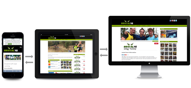
Responsive Web Design (RWD) is an approach of laying-out and coding a website such that the website provides an optimal viewing experience — ease of reading and navigation with a minimum of resizing, panning, and scrolling — across a wide range of devices (from desktop computer monitors to mobile phones).
The designer creating a Responsive Design should ensure that the website’s navigation elements, screen-layouts, text, images, audio/video players and other UI elements re-adjust themselves on a variety of devices.
Thus, one need not spend extra time and money in creating and maintaining one “mobile-site version” and another “desktop-site version” of her website.
Now, having understood what is Responsive Web Design, let us Check the advantages and why Responsive Design is important while creating websites.
Advantages of Responsive Design
1. Super Flexible Responsive web design sites are fluid, meaning the content moves freely across all screen resolutions and all devices.Both the grids and the images are fluid. Just as a liquid spreads out or draws in to allow its content to fill an allotted space and retain its appearance, responsive web design’s fluidity achieves the same result with website content on a device screen.
2. Excellent User Experience

While, content is king and discover ability of content are foremost success metrics, it is the user experience that enables visitors to consume content on any website through the device of their choice and preference, anytime.
Thus, responsive web design is about providing the optimal user experience irrespective of whether they use a desktop computer, a smartphone, a tablet or a smart-TV.
Responsive web design accommodates the busy professional during the day and the wide-awake college student needing access to your site anytime. No scrolling or resizing is needed for any visitor to access your website from their favorite device.
3. Cost Effective

The advantages of having a single site that conforms to the need of all devices are significant when compared to having two separate websites. One website costs less than two, and the savings can be substantial.
Sites designed solely for mobile device traffic don’t offer the advanced navigational techniques found in traditional websites, and they also require the user to maintain two separate web addresses for your site.
This is inconvenient for most people and can cause them to check out the competition’s website. Responsive web design enhances SEO efforts by having all your visitors directed to a single site no matter what they prefer to use as a device.
4. It is Recommended By Google

With 67 percent search market share, when Google speaks, search marketers listen.
Google states that responsive web design is its recommended mobile configuration, and even goes so far as to refer to responsive web design as the industry best practice.
This is because responsive design sites have one URL and the same HTML, regardless of device, which makes it easier and more efficient for Google to crawl, index, and organize content.
Contrast this with a separate mobile site which has a different URL and different HTML than its desktop counterpart, requiring Google to crawl and index multiple versions of the same site.
Additionally, Google prefers responsive web design because content that lives on one website and one URL is much easier for users to share, interact with, and link to than content that lives on a separate mobile site.
Take for example a mobile user who shares content from a mobile site with a friend on Facebook who then accesses that content using a desktop, which results in that user viewing a stripped down mobile site on their desktop.
This creates a less than optimal user-experience, and because of the large emphasis Google is now placing on user-experience as a ranking factor, this is essential to take into account with regards to SEO.
5. Very Easy to manage

Having a separate desktop and mobile site requires having separate SEO campaigns.
Managing one site and one SEO campaign is far easier than managing two sites and two SEO campaigns.
This is a key advantage a responsive website has over a separate mobile site.
That being said, there are benefits to having a mobile-specific SEO strategy, such as optimizing for keywords that are more likely to be searched when someone is on their smartphone.
For example, someone performing a mobile search for a local restaurant may be more inclined to use the word “nearby” in their search query.
However, a separate mobile site is not a requirement for a mobile SEO strategy, and there’s no reason why mobile-specific keywords can’t be incorporated into a responsive design site as well.
At the end it is your decision, whether you take it or not.